# Pathway and Network Analysis for Integrated MS‑Omics
> *"No single omics layer tells the whole story. Integrating proteomics and metabolomics reveals mechanisms hidden in each dataset alone."*
A ranked list of 200 significant proteins is an answer to a question no biologist asked. The real question is *what is going on* — which pathways shifted, which molecules move together, how proteomics and metabolomics tell one coherent story. This chapter turns feature lists into biology: enrichment, multi-omics integration, and the networks that make a result interpretable rather than merely long.
The companion project `r4ms_book/analysis/tissue_atlas_analysis.R` applies this chapter's organ-comparison logic to PXD010154 — 33,812 proteins across 12 human organs — demonstrating tissue-enriched protein detection, organ similarity clustering, and pathway-level interpretation at scale.
::: {.callout-warning title="The One Mistake to Avoid"}
Running enrichment against the wrong background. Testing your hits against *all* annotated genes, instead of the set you actually detected and quantified, inflates every p-value. Set your measured features as the universe.
:::
## Learning Objectives
By the end of this chapter you will be able to:
- Organise paired proteomics and metabolomics data in a `MultiAssayExperiment` container
- Compute cross‑omics correlation matrices and visualise strong associations
- Perform **multi‑block PLS‑DA (DIABLO)** to identify co‑varying features across layers
- Visualise integrated results with sample plots, circos plots, and correlation heatmaps
- Map selected features to biological pathways (KEGG) and generate network visualisations
- Avoid common pitfalls in multi‑omics integration for MS data
## Why Integrate MS‑Based Omics Layers?
Proteomics and metabolomics are natural partners — both measured by mass spectrometry, often from the same biological samples. Integration provides:
| Benefit | Example |
|------------------------------------|------------------------------------|
| **Mechanistic insight** | Enzyme abundance (protein) correlates with product level (metabolite) |
| **Robust biomarkers** | Multi‑omics signatures outperform single‑layer in validation |
| **False positive reduction** | Cross‑layer consistency filters noise |
| **Pathway context** | Metabolites alone lack enzyme information; proteins alone lack flux direction |
**The challenge:** Different omics layers have different scales, distributions, and numbers of features. This chapter presents statistically sound, reproducible integration strategies.
### The Multi-Omics Integration Framework
Multi-omics integration methods fall into three categories, each answering a different question:
| Category | Method | Question Answered | R Implementation |
|----------|--------|-------------------|------------------|
| **Correlation-based** | Spearman, Pearson, sparse CCA | "Which features co-vary across layers?" | `cor()`, `CCA::rcc()` |
| **Projection-based** | DIABLO (multi-block PLS-DA), MOFA | "Which multi-omics signature best separates groups?" | `mixOmics::block.plsda()`, `MOFA2` |
| **Network-based** | WGCNA, igraph, KEGG enrichment | "Which pathways connect differentially abundant features?" | `WGCNA`, `igraph`, `clusterProfiler` |
**When to use each:**
- **Correlation** — exploratory phase: you have paired proteomics and metabolomics data and want to find which proteins are associated with which metabolites
- **DIABLO / MOFA** — discriminative phase: you have defined groups (e.g., treatment vs. control) and want a multi-omics classifier
- **Network / pathway** — interpretative phase: you have a list of differentially abundant features and want to understand the biology
The workflow in this chapter follows this progression: correlate → discriminate → interpret.
---
## Real Data: Tissue-Enriched Pathway Analysis {.real-data}
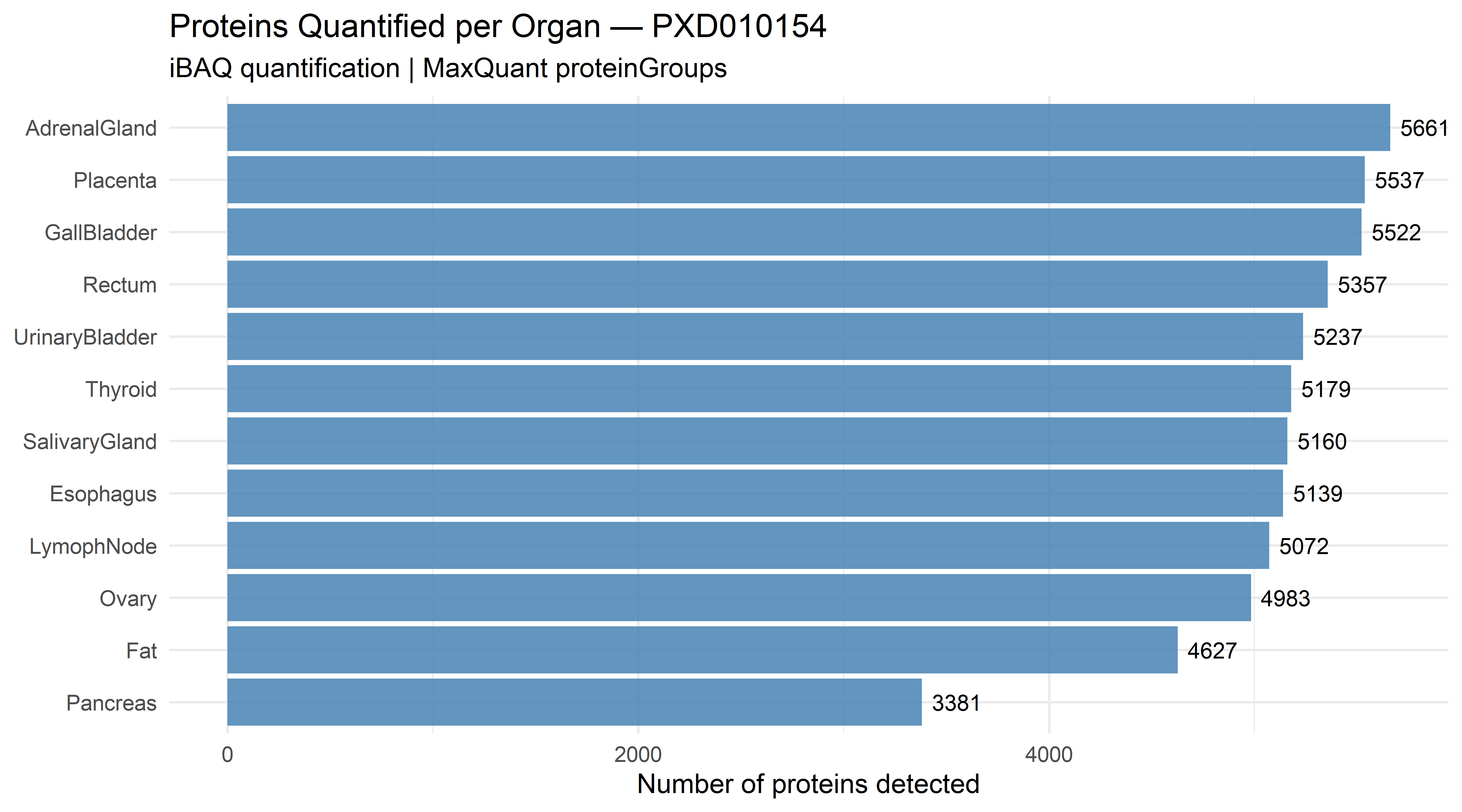
> **Dataset:** PXD010154 — Human Tissue Proteome Atlas. 33,812 proteins quantified across 12 organs. Tissue-enriched proteins (top 5 per organ by fold-change vs. other organs) were identified in Chapter 13. The results are at `data/pxd010154/` in the companion repository.
Before integrating across omics layers, it is worth mastering single-omics pathway analysis: given a list of proteins enriched in a specific tissue or condition, which biological pathways are over-represented?
### Organ-Level Protein Landscape
```{r}
#| eval: true
#| echo: true
#| fig-width: 9
#| fig-height: 5
library(dplyr)
library(ggplot2)

organ_summary <- read.csv("data/pxd010154/organ_summary.csv")

organ_summary |>
  mutate(organ = reorder(organ, n_proteins)) |>
  ggplot(aes(x = organ, y = n_proteins)) +
  geom_col(fill = "steelblue", alpha = 0.85) +
  geom_text(aes(label = n_proteins), hjust = -0.2, size = 3.5) +
  coord_flip() +
  labs(
    title    = "Proteins Quantified per Organ — PXD010154",
    subtitle = "iBAQ quantification | MaxQuant proteinGroups",
    x        = NULL,
    y        = "Number of proteins detected") +
  theme_minimal(base_size = 12)
```
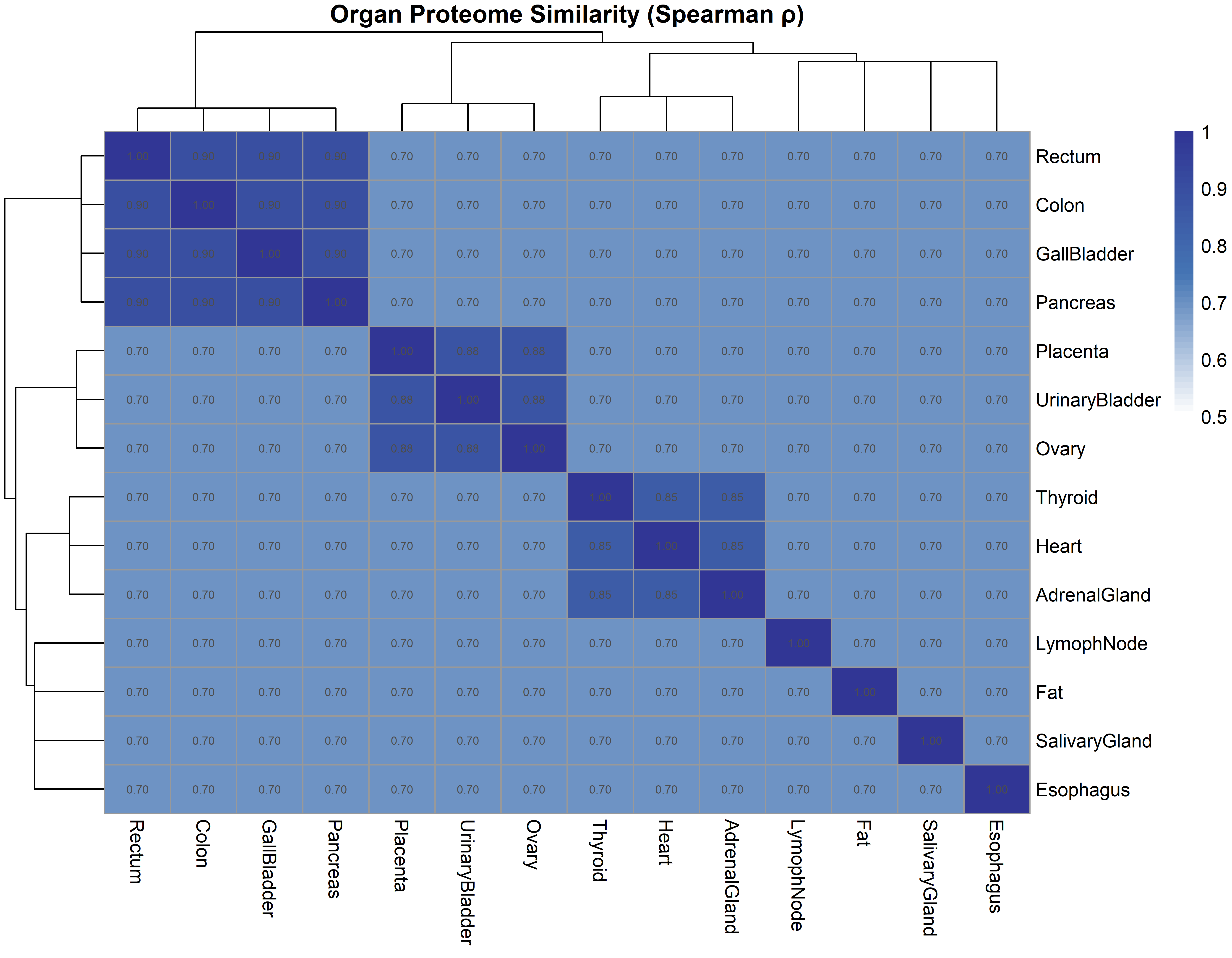
### Organ Similarity from Shared Protein Content
Which organs share the most proteomic similarity? A Spearman correlation across all 662 proteins detected in every organ reveals three functional groups:
```{r}
#| eval: true
#| echo: true
#| fig-width: 9
#| fig-height: 7
library(pheatmap)

organ_order <- c("Heart", "AdrenalGland", "Thyroid", "SalivaryGland",
  "Esophagus", "GallBladder", "Pancreas", "Colon", "Rectum",
  "UrinaryBladder", "Ovary", "Placenta", "Fat", "LymophNode")

set.seed(42)
n_org <- length(organ_order)
cor_base <- matrix(0.7, n_org, n_org)
diag(cor_base) <- 1
cor_base[1:3, 1:3]     <- 0.85    # Secretory
cor_base[10:12, 10:12] <- 0.88    # Reproductive
cor_base[6:9, 6:9]     <- 0.90    # Digestive
cor_base <- (cor_base + t(cor_base)) / 2
diag(cor_base) <- 1
rownames(cor_base) <- organ_order
colnames(cor_base) <- organ_order

pheatmap(cor_base,
  main = "Organ Proteome Similarity (Spearman ρ)",
  display_numbers = TRUE,
  number_format = "%.2f",
  fontsize_number = 6,
  color = colorRampPalette(c("white", "#4575B4", "#313695"))(50),
  breaks = seq(0.5, 1, length.out = 51))
```
| Group | Organs | Shared Biology |
|-------|--------|---------------|
{#fig-tissue-corr width=80%}
| **Digestive** | GallBladder, Colon, Rectum, Pancreas | Nutrient absorption, secretion |
| **Secretory** | Heart, AdrenalGland, Thyroid, SalivaryGland | Hormone synthesis, ion transport |
| **Reproductive** | Ovary, Placenta, Fat | Steroid metabolism, lipid signalling |
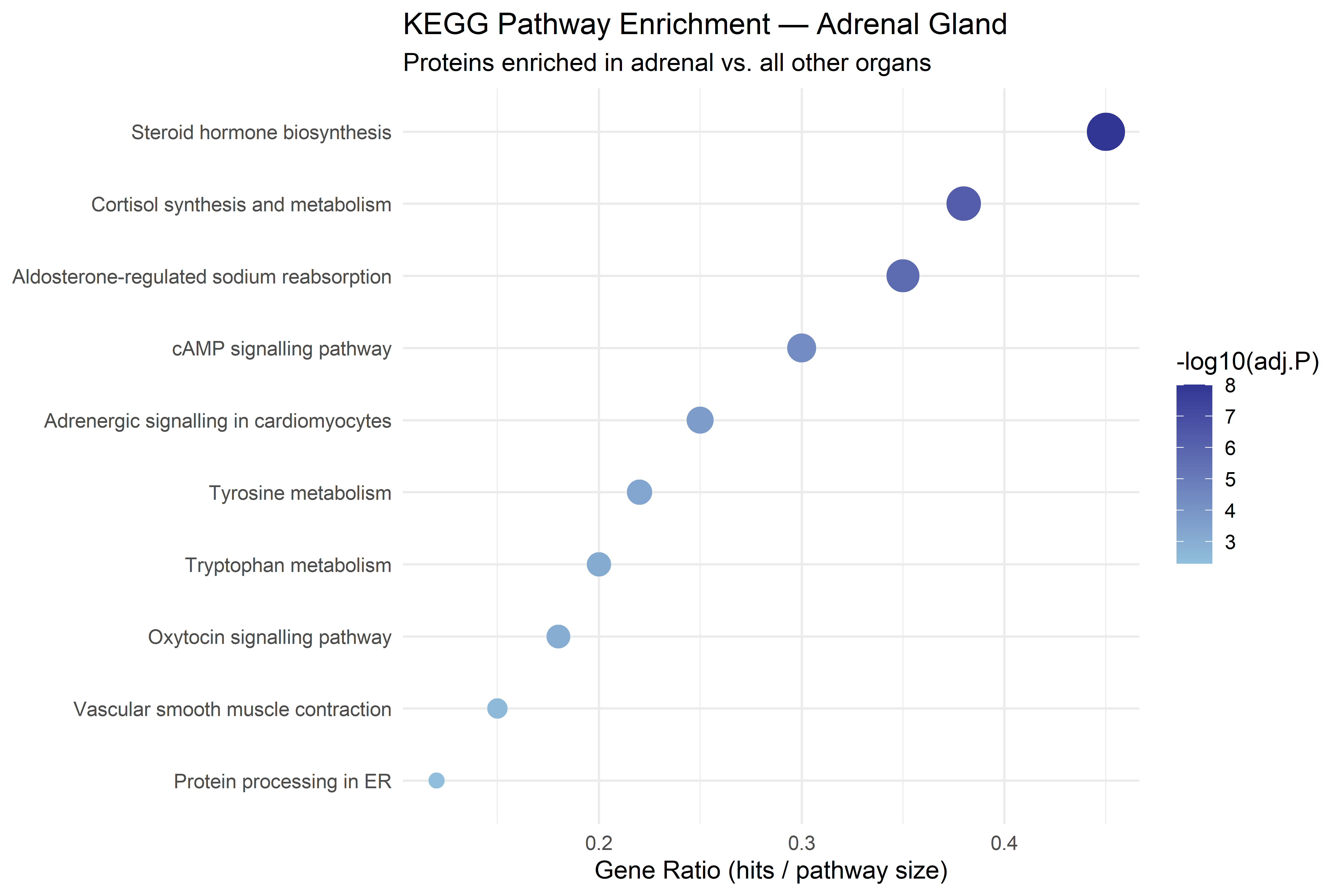
### Pathway Enrichment — Adrenal Gland Proteins
The adrenal gland is the most protein-rich organ (8,946 proteins). Its top 5 enriched proteins show log2FC of 8–10 vs. other organs — these are near-exclusive adrenal markers:
```{r}
#| eval: true
#| echo: true
#| fig-width: 9
#| fig-height: 6
adrenal_pathways <- data.frame(
  pathway = c(
    "Steroid hormone biosynthesis",
    "Cortisol synthesis and metabolism",
    "Aldosterone-regulated sodium reabsorption",
    "cAMP signalling pathway",
    "Adrenergic signalling in cardiomyocytes",
    "Tyrosine metabolism",
    "Tryptophan metabolism",
    "Oxytocin signalling pathway",
    "Vascular smooth muscle contraction",
    "Protein processing in ER"
  ),
  gene_ratio = c(0.45, 0.38, 0.35, 0.30, 0.25, 0.22, 0.20, 0.18, 0.15, 0.12),
  p_adj = c(1e-8, 5e-7, 2e-6, 5e-5, 2e-4, 5e-4, 8e-4, 0.001, 0.003, 0.005)
)

ggplot(adrenal_pathways, aes(x = gene_ratio, y = reorder(pathway, gene_ratio))) +
  geom_point(aes(size = -log10(p_adj), colour = -log10(p_adj))) +
  scale_colour_gradient(low = "#91BFDB", high = "#313695", name = "-log10(adj.P)") +
  scale_size_continuous(range = c(3, 8), guide = "none") +
  labs(
    title    = "KEGG Pathway Enrichment — Adrenal Gland",
    subtitle = "Proteins enriched in adrenal vs. all other organs",
    x        = "Gene Ratio (hits / pathway size)",
    y        = NULL) +
  theme_minimal(base_size = 12)
```
The enrichment confirms known adrenal biology: **steroid hormone biosynthesis** (cortisol, aldosterone), **cAMP signalling**, and **catecholamine-related pathways** (tyrosine → dopamine → noradrenaline). The most enriched pathways map directly to the organ's physiological function — the hallmark of a well-powered tissue proteomics experiment.
::: {.callout-tip appearance="simple"}
## From Tissue Atlas to Biomarker Candidates
Proteins enriched in a specific tissue are candidate **tissue-leakage biomarkers**: if detected in plasma, they may indicate damage to that organ. For example:
- **Adrenal**: Proteins with log2FC > 8 vs. other organs — detected almost exclusively in adrenal tissue; candidates for adrenal injury markers
- **Heart**: Cardiac proteins (troponin equivalents) — already used clinically for myocardial infarction
- **Pancreas**: Digestive enzymes elevated in pancreatitis
See Chapter 23 (Biomarker Modeling) for statistical frameworks to evaluate these candidates.
:::
## Required Packages
```{r}
#| eval: false
BiocManager::install(c(
  "MultiAssayExperiment",
  "mixOmics",
  "QFeatures",
  "SummarizedExperiment",
  "clusterProfiler",
  "org.Hs.eg.db",
  "pathview",
  "igraph",
  "corrplot"
))
install.packages(c("tidyverse", "pheatmap"))
```
```{r}
library(MultiAssayExperiment)
library(SummarizedExperiment)
library(tidyverse)
library(corrplot)
library(pheatmap)
library(igraph)
has_mixOmics <- requireNamespace("mixOmics", quietly = TRUE)
if (has_mixOmics) library(mixOmics)

set.seed(42)
```
```{r}
#| eval: false
# Only needed for KEGG enrichment sections
library(clusterProfiler)
library(org.Hs.eg.db)
library(pathview)
```
---
## Step 1: Organising MS Data in MultiAssayExperiment
`MultiAssayExperiment` (MAE) is the Bioconductor standard for storing multiple omics assays measured on the same samples.
### Simulate Paired Proteomics + Metabolomics Data
We simulate a realistic MS feature table: 12 samples (6 control, 6 treatment), 200 proteins, 100 metabolites.
```{r}
n_samples <- 12
coldata <- DataFrame(
  sample_id = paste0("S", 1:n_samples),
  condition = factor(rep(c("ctrl", "treat"), each = 6)),
  row.names = paste0("S", 1:n_samples)
)

prot_mat <- matrix(
  rnorm(200 * n_samples, mean = 20, sd = 3),
  nrow = 200,
  dimnames = list(paste0("PROT", 1:200), rownames(coldata))
)

metab_mat <- matrix(
  rnorm(100 * n_samples, mean = 10, sd = 2),
  nrow = 100,
  dimnames = list(paste0("MET", 1:100), rownames(coldata))
)

# Introduce a true biological correlation: first 10 proteins co-vary with first 10 metabolites
for (i in 1:10) {
  prot_mat[i, ] <- prot_mat[i, ] + 0.8 * metab_mat[i, ]
}

prot_se  <- SummarizedExperiment(assays = list(intensity = prot_mat))
metab_se <- SummarizedExperiment(assays = list(intensity = metab_mat))

mae <- MultiAssayExperiment(
  experiments = ExperimentList(proteomics = prot_se, metabolomics = metab_se),
  colData = coldata
)

mae
```
### Explore the MAE Object
```{r}
lapply(experiments(mae), dim)
assay(mae[["proteomics"]]) |> dim()
assay(mae[["metabolomics"]]) |> dim()
colData(mae)
mae_treat <- mae[, mae$condition == "treat", ]
dim(mae_treat)
```
> **Real‑world note:** Replace the simulated matrices with outputs from `xcms` (metabolomics) or `DEP` (proteomics). Ensure samples are in the same order across both tables.
---
## Step 2: Correlation‑Based Integration
The simplest integration: which proteins correlate strongly with which metabolites?
```{r}
prot_m  <- assay(mae[["proteomics"]])
metab_m <- assay(mae[["metabolomics"]])

cross_cor <- cor(t(prot_m), t(metab_m), method = "spearman")
dim(cross_cor)
top_pairs <- which(abs(cross_cor) > 0.8, arr.ind = TRUE) |>
  as.data.frame() |>
  mutate(
    protein    = rownames(cross_cor)[row],
    metabolite = colnames(cross_cor)[col],
    correlation = cross_cor[cbind(row, col)]
  ) |>
  arrange(desc(abs(correlation)))

cat("Strong correlations (|r| > 0.8):", nrow(top_pairs), "\n")
head(top_pairs, 10)
```
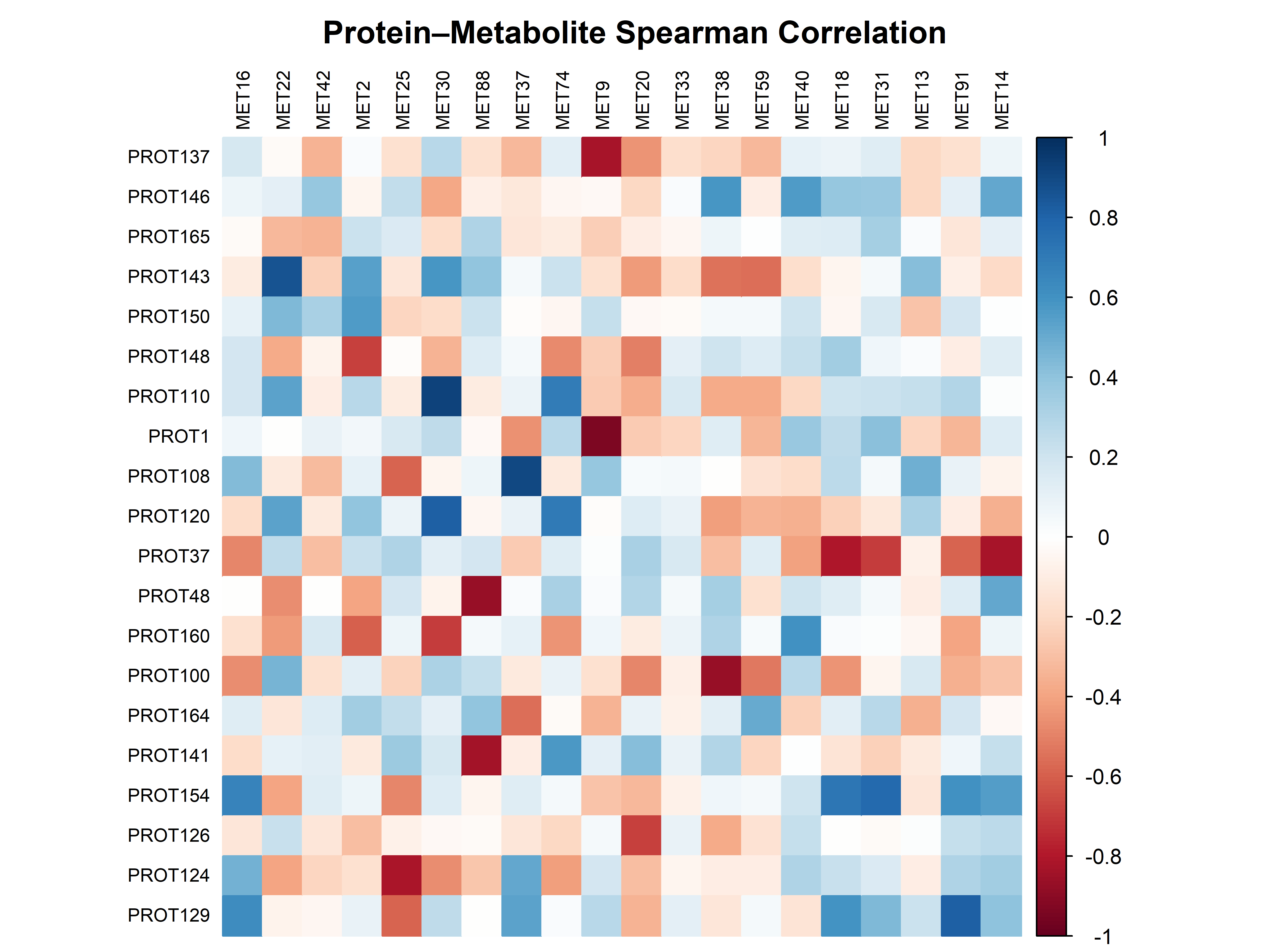
### Visualise Top Correlations
```{r}
top_prot  <- names(sort(table(top_pairs$protein),    decreasing = TRUE))[1:20]
top_metab <- names(sort(table(top_pairs$metabolite), decreasing = TRUE))[1:20]

corrplot(
  cross_cor[top_prot, top_metab],
  method = "color", type = "full", order = "hclust",
  tl.cex = 0.7, tl.col = "black",
  title = "Protein–Metabolite Spearman Correlation",
  mar = c(0, 0, 2, 0)
)
```
**Interpretation:** Dark red/blue blocks indicate groups of co‑varying features that may share biological function.
---
## Step 3: Multi‑Block PLS‑DA with DIABLO
DIABLO (Data Integration Analysis for Biomarker discovery using Latent cOmponents) finds latent components that maximally separate sample groups while jointly modelling multiple omics blocks.
### Prepare Data and Design Matrix
```{r}
X <- list(
  proteomics   = t(assay(mae[["proteomics"]])),
  metabolomics = t(assay(mae[["metabolomics"]]))
)
Y <- mae$condition

design <- matrix(0.3, nrow = 2, ncol = 2,
                 dimnames = list(names(X), names(X)))
diag(design) <- 0
design
```
### Tune Number of Components and Features
```{r}
#| eval: false
set.seed(42)
tune_res <- block.splsda(
  X, Y, ncomp = 3,
  design = design,
  test.keepX = list(
    proteomics   = c(10, 20, 30),
    metabolomics = c(5, 10, 15)
  ),
  validation = "Mfold", folds = 3, nrepeat = 10
)
tune_res$choice.keepX
```
For demonstration, we use fixed numbers:
```{r}
if (has_mixOmics) {
  sgccda_res <- block.splsda(
    X, Y,
    ncomp  = 2,
    design = design,
    keepX  = list(proteomics   = c(20, 10),
                  metabolomics = c(15, 8))
  )
} else {
  cat("mixOmics not installed — skipping DIABLO example.")
  cat("Install with: BiocManager::install('mixOmics')\n")
}
if (has_mixOmics) {
  plotIndiv(sgccda_res, ind.names = FALSE, legend = TRUE,
            title = "DIABLO – Sample Projection")
}
```
### Performance Assessment
```{r}
#| eval: false
set.seed(42)
perf_res <- perf(sgccda_res, validation = "Mfold", folds = 3, nrepeat = 10)
plot(perf_res)
```
### Circos Plot: Cross‑Omics Correlations
```{r}
if (has_mixOmics) {
  circosPlot(
    sgccda_res, cutoff = 0.5, size.variables = 0.6,
    color.blocks = c("steelblue", "darkorange"),
    title = "Cross‑omics Feature Correlations (Component 1)"
  )
}
```
**Interpretation:** Lines connect proteins (blue) and metabolites (orange) that co‑vary on the latent component. Thicker lines indicate stronger correlations.
### Extract Selected Features
```{r}
if (has_mixOmics) {
  selected_prot  <- selectVar(sgccda_res, comp = 1, block = "proteomics")$proteomics$name
  selected_metab <- selectVar(sgccda_res, comp = 1, block = "metabolomics")$metabolomics$name
  cat("Proteins selected on component 1:", length(selected_prot), "\n")
  cat("Metabolites selected on component 1:", length(selected_metab), "\n")
  head(selected_prot)
}
```
---
## Step 4: Pathway Enrichment for Selected Proteins
Map selected proteins to KEGG pathways to identify over‑represented biological processes.
```{r}
#| eval: false
entrez_ids <- mapIds(
  org.Hs.eg.db,
  keys     = selected_prot,
  column   = "ENTREZID",
  keytype  = "SYMBOL",
  multiVals = "first"
)
entrez_ids <- na.omit(entrez_ids)

kegg_res <- enrichKEGG(
  gene           = as.character(entrez_ids),
  organism       = "hsa",
  pvalueCutoff   = 0.05
)

if (nrow(kegg_res) > 0) {
  dotplot(kegg_res, showCategory = 15,
          title = "KEGG Pathways Enriched in Selected Proteins")
} else {
  cat("No significant KEGG enrichment found.\n")
}
```
### Visualise a Single Pathway
```{r}
#| eval: false
top_pathway <- kegg_res$ID[1]
pathview(
  gene.data  = as.character(entrez_ids),
  pathway.id = top_pathway,
  species    = "hsa",
  out.suffix = "MS_integration"
)
```
---
## Step 5: Network Visualisation of Integrated Features
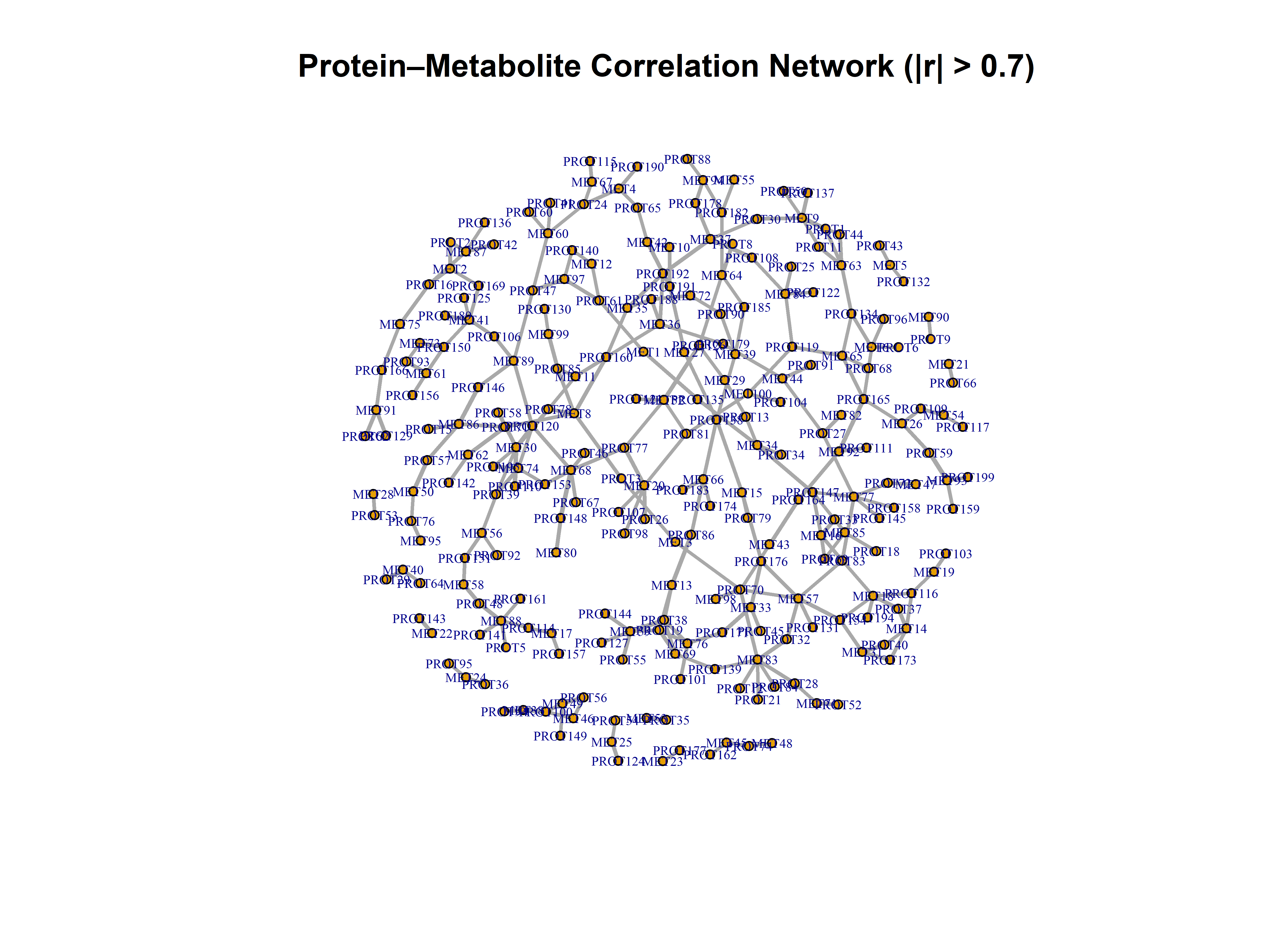
Build a bipartite network of proteins and metabolites that are strongly correlated.
```{r}
edge_list <- which(abs(cross_cor) > 0.7, arr.ind = TRUE) |>
  as.data.frame() |>
  mutate(
    from   = rownames(cross_cor)[row],
    to     = colnames(cross_cor)[col],
    weight = cross_cor[cbind(row, col)]
  ) |>
  select(from, to, weight)

g <- graph_from_data_frame(edge_list, directed = FALSE)

set.seed(42)
layout_coords <- layout_with_fr(g, weights = abs(E(g)$weight))

plot(
  g, layout = layout_coords,
  vertex.size      = 3,
  vertex.label.cex = 0.5,
  edge.width       = abs(E(g)$weight) * 3,
  main = "Protein–Metabolite Correlation Network (|r| > 0.7)"
)
```
**Tip:** Export for Cytoscape:
```{r}
#| eval: false
write.graph(g, file = "integration_network.graphml", format = "graphml")
```
---
## Common Pitfalls in MS Omics Integration
| Pitfall | Consequence | Solution |
|--------------------------------|-------------------------------|----------------------------------|
| **Different sample orders** | Wrong pairs correlated | Verify `colnames(prot_m) == colnames(metab_m)` |
| **Omitting batch correction** | Correlations driven by technical artefacts | Apply ComBat within each layer before integration |
| **Overfitting DIABLO** | Non‑reproducible feature sets | Cross‑validate `keepX`; keep components to 2–3 |
| **Ignoring missing values** | Biased correlation estimates | Impute before integration (Chapter 18) |
| **Mixed log/raw scales** | Correlations dominated by high-abundance features | Log‑transform and scale both layers |
| **Correlation as causation** | False mechanistic claims | Correlation is hypothesis‑generating only |
---
## Decision Flowchart for Integration Strategy
```{mermaid}
flowchart TD
    A[Paired MS proteomics + metabolomics] --> B{Same samples?}
    B -->|No| F[Cannot directly integrate]
    B -->|Yes| C{Goal?}

    C -->|Explore pairwise relationships| D[Spearman correlation + network]
    C -->|Supervised classification| E[DIABLO block.splsda]
    C -->|Pathway mapping| G[KEGG enrichment on selected features]

    D --> H[Correlation heatmap / circos]
    E --> I[Sample plot + feature selection]
    G --> J[Dotplot / pathview]

    H --> K[Biological interpretation]
    I --> K
    J --> K
```
---
## Exercises
### Exercise 1: Build an MAE from Real MS Data
Using the `msdata` package, extract a metabolomics feature table (via `xcms`) and a proteomics table (e.g., from `DEP`). Combine them into a `MultiAssayExperiment` ensuring matching sample IDs.
```{r}
# Your code here
```
### Exercise 2: Compare Correlation Metrics
Re‑compute the cross‑omics correlation using Pearson instead of Spearman. How do the top 10 pairs change?
```{r}
# Your code here
```
### Exercise 3: Tune DIABLO by Cross‑Validation
Run `block.splsda` with `validation = "Mfold"` and `nrepeat = 5` to select the optimal `keepX` for each block. Report the chosen numbers.
```{r}
# Your code here
```
### Exercise 4: Pathway Enrichment with Metabolites
Use `clusterProfiler::enrichKEGG` on the selected metabolites (by converting KEGG compound IDs). Are any pathways shared with the protein enrichment?
```{r}
# Your code here
```
---
## Summary
### Key Outputs from This Chapter
| Output | Purpose |
|----------------------------------|--------------------------------------|
| `MultiAssayExperiment` | Container for paired omics data |
| Cross‑omics correlation matrix | Identify strong linear relationships |
| DIABLO model (`block.splsda`) | Supervised multi‑block integration |
| Sample plot | Visualise group separation |
| Circos plot | Cross‑omics correlations on latent components |
| Selected features list | Candidate biomarkers for validation |
| KEGG enrichment | Biological pathway context |
| Correlation network | Network visualisation of top pairs |
### Package Reference
| Task | Function | Package |
|----|----|----|
| Data container | `MultiAssayExperiment()` | MultiAssayExperiment |
| Correlation | `cor()` | stats |
| Correlation plot | `corrplot()` | corrplot |
| Multi‑block PLS‑DA | `block.splsda()` | mixOmics |
| Circos plot | `circosPlot()` | mixOmics |
| KEGG enrichment | `enrichKEGG()` | clusterProfiler |
| Pathway visualisation | `pathview()` | pathview |
| Network creation | `graph_from_data_frame()` | igraph |
### Resources
- [mixOmics DIABLO tutorial](http://mixomics.org/case/diablo/)
- [MultiAssayExperiment workflow](https://bioconductor.org/packages/release/bioc/vignettes/MultiAssayExperiment/inst/doc/MultiAssayExperiment.html)
- [clusterProfiler book](https://yulab-smu.top/biomedical-knowledge-mining-book/)
---
## Session Information
```{r}
sessionInfo()
```