# Perform Initial Quality Control
> *“Bad metadata can destroy a good experiment faster than bad code.”*
A surprising share of "surprising biology" in mass spectrometry turns out to be a pipetting slip, a drifting instrument, or a contaminated blank. The samples that will wreck your conclusions are usually visible on day one — if you look. This chapter is about looking: the handful of plots and checks that catch bad runs before they become bad papers.
::: {.callout-warning title="The One Mistake to Avoid"}
Skipping QC because the run "looked fine." Drift, carryover, and swapped samples rarely announce themselves — they resurface weeks later as spurious hits. Inspect QC pools and blanks *before* any modeling.
:::
## Learning Objectives
By the end of this chapter you will be able to:
- Annotate samples with biological groups, batches, blanks, and QC pools\
- Link metadata to MS spectra and feature tables\
- Detect metadata inconsistencies (mismatched sample names, duplicates)\
- Visualise total ion current (TIC) and base peak chromatograms (BPC)\
- Assess retention time stability across runs\
- Evaluate mass accuracy and intensity distributions\
- Identify blank contamination and carryover\
- Generate a comprehensive MS quality control report
## Why QC Before Modeling?
Quality control is **not** optional – it is the foundation of reproducible MS omics. Poor‑quality data, unannotated batches, or contaminated blanks will invalidate any downstream statistical analysis. Initial QC answers:
| Question | Check |
|------------------------------------------|----------------------------|
| Did the instrument perform consistently? | TIC, BPC, RT stability |
| Are samples correctly labelled? | Metadata vs file names |
| Is there batch-to-batch variation? | PCA by batch, TIC by batch |
| Are blanks clean? | Feature counts in blanks |
| Is mass accuracy within tolerance? | m/z of known QC peaks |
### The QC Gate Principle
Think of initial QC as a **gate**, not an afterthought. A dataset that fails QC should not proceed to preprocessing — the downstream analysis will produce results, but they will be unreliable. The core principle is:
> **If you cannot tell the difference between biological variation and technical noise, no statistical test can do it for you.**
Three statistical principles underpin effective QC:
1. **Visualise before testing.** A TIC overlay reveals sample-to-sample variation instantly; a boxplot of log-intensities per sample catches loading issues that summary statistics miss. Formal tests (t-tests, ANOVA) come second, not first.
2. **QC samples are your internal standard for the entire pipeline.** Pooled QC samples injected at regular intervals throughout the run provide the only honest estimate of technical variation. The CV of each feature in QC samples is the **upper bound of reliability** — if a feature's QC CV is 40 %, any fold-change below 1.4 is noise regardless of the p-value.
3. **Metadata errors are the most common and most damaging QC failure.** A swapped sample label, a missing batch annotation, or a confounded design produces results that look correct but are biologically meaningless. Automated checks (`all()`, `identical()`, `table(batch, condition)`) catch these before they propagate.
This chapter focuses on **initial** QC – before preprocessing, imputation, or modeling. All steps use the `msdata` package for reproducible demonstration.
------------------------------------------------------------------------
## Required Packages
```{r}
#| eval: false
BiocManager::install(c(
  "MSnbase",          # MS data handling
  "Spectra",          # Modern MS data structures
  "mzR",              # Raw file access
  "MsExperiment",     # Sample metadata + spectra
  "msdata",           # Example files
  "ggplot2",
  "dplyr",
  "tidyr"
))
```
```{r}
# Load libraries
library(msdata)
library(ggplot2)
library(dplyr)
library(tidyr)

set.seed(42)
```
------------------------------------------------------------------------
## Step 1: Sample Annotation and Experimental Design
Metadata must be recorded before any analysis. Essential fields:
- **sample_name** – unique identifier matching file names\
- **biological_group** – treatment, genotype, time point\
- **batch** – instrument run date/sequence\
- **injection_order** – numerical order in the queue\
- **type** – `sample`, `blank`, `qc_pool`, `standard`
### Create Metadata Table
The `msdata` package provides example mzML files. We'll build a metadata table matching these files.
```{r}
# Locate example mzML files
mzml_files <- proteomics(full.names = TRUE)
mzml_files <- mzml_files[1:4]  # use 4 files for clean pairs
n_files <- length(mzml_files)

# Create metadata
metadata <- data.frame(
  file_name = basename(mzml_files),
  sample_name = paste0("S", 1:n_files),
  biological_group = rep(c("Control", "Treatment"), each = n_files/2),
  batch = rep(c(1, 2), each = n_files/2),
  injection_order = 1:n_files,
  type = "sample"   # all are real samples, no blanks/QC in this set
)

head(metadata)
```
> **What this shows:** Each row is one mzML file from the `msdata::proteomics()` collection. `file_name` matches actual files on disk, `sample_name` provides short labels for plots, `biological_group` assigns each sample to Control or Treatment (evenly split), and `batch` groups the first two files vs. the last two. The `type` column is set to `"sample"` — real study samples. In a real experiment you would also have `"blank"` and `"qc_pool"` rows.
**Best practice:** Keep metadata in a CSV file separate from your analysis script, and read it in.
```{r}
# write.csv(metadata, "sample_metadata.csv", row.names = FALSE)
```
------------------------------------------------------------------------
## Step 2: Biological Groups, Batches, Blanks, and Pooled QC
### Why Include Blanks and QC Pools?
| Sample Type | Purpose |
|-----------------------|------------------------------------------|
| **Biological sample** | Experimental interest |
| **Blank** | Assess contamination and carryover |
| **Pooled QC** | Monitor instrument stability across runs |
| **Standard** | Calibrate retention time and m/z |
### Simulate a Dataset with QC Samples
For demonstration, we extend the `msdata` files with simulated QC samples (since real QC files are not included).
```{r}
# Simulate intensities for 3 QC samples (pooled)
n_features <- 100
n_qc <- 3
qc_intensity <- matrix(rlnorm(n_features * n_qc, meanlog = 10, sdlog = 1),
                       nrow = n_features, ncol = n_qc)
colnames(qc_intensity) <- paste0("QC_", 1:n_qc)

# Add QC metadata
qc_metadata <- data.frame(
  file_name = colnames(qc_intensity),
  sample_name = colnames(qc_intensity),
  biological_group = "QC",
  batch = 1,
  injection_order = max(metadata$injection_order) + 1:n_qc,
  type = "qc_pool"
)

# Combine with real metadata
metadata_full <- bind_rows(metadata, qc_metadata)
tail(metadata_full)
```
**Real‑world note:** You must run blanks and QC samples on the instrument. Never rely on simulation.
------------------------------------------------------------------------
## Step 3: Linking Metadata to Spectra and Feature Tables
Before any QC plot, ensure metadata matches the spectral data.
### Link to Raw Spectra (MsExperiment)
For this demonstration we use the metadata table directly. In practice you would
connect real mzML files via `Spectra(mzml_files)` or `readMsExperiment()` (see Chapter 4).
```{r}
cat("Number of files:", nrow(metadata), "\n")
cat("File names:\n")
cat(paste(" ", metadata$file_name), sep = "\n")
```
### Link to Feature Table (After Preprocessing)
After preprocessing (e.g., with `xcms`), you will have a feature matrix. Always check column order.
```{r}
# Simulated feature matrix: rows = features, columns = samples
feature_mat <- matrix(rnorm(100 * nrow(metadata), mean = 10, sd = 2),
                      nrow = 100, ncol = nrow(metadata))
colnames(feature_mat) <- metadata$sample_name
rownames(feature_mat) <- paste0("Metab_", 1:100)

# Verify sample names match metadata
all(colnames(feature_mat) == metadata$sample_name)  # must be TRUE
```
**Critical:** Never rely on visual inspection – use `all()` or `identical()`.
------------------------------------------------------------------------
## Step 4: Detecting Metadata Inconsistencies
Common metadata errors:
- **Duplicate sample names**\
- **Mismatch between file names and metadata**\
- **Missing injection order**\
- **Batch confounded with biological group** (e.g., all controls in batch 1, all treatments in batch 2)
### Check for Duplicates
```{r}
any(duplicated(metadata$sample_name))
any(duplicated(metadata$file_name))
```
### Check File Existence
```{r}
all(file.exists(mzml_files))
```
### Detect Batch–Group Confounding
```{r}
table(metadata$batch, metadata$biological_group)
```
If a batch contains only one biological group, batch and group are **confounded** – you cannot distinguish technical from biological variation. **Solution:** Redesign the experiment or use a different statistical approach.
### Check Injection Order Completeness
```{r}
all(1:nrow(metadata) == sort(metadata$injection_order)) # assuming no gaps
```
------------------------------------------------------------------------
## Step 5: TIC and BPC Quality Control
Total Ion Current (TIC) and Base Peak Chromatogram (BPC) are the first QC plots for raw LC‑MS data.
### Extract TIC from Raw Files
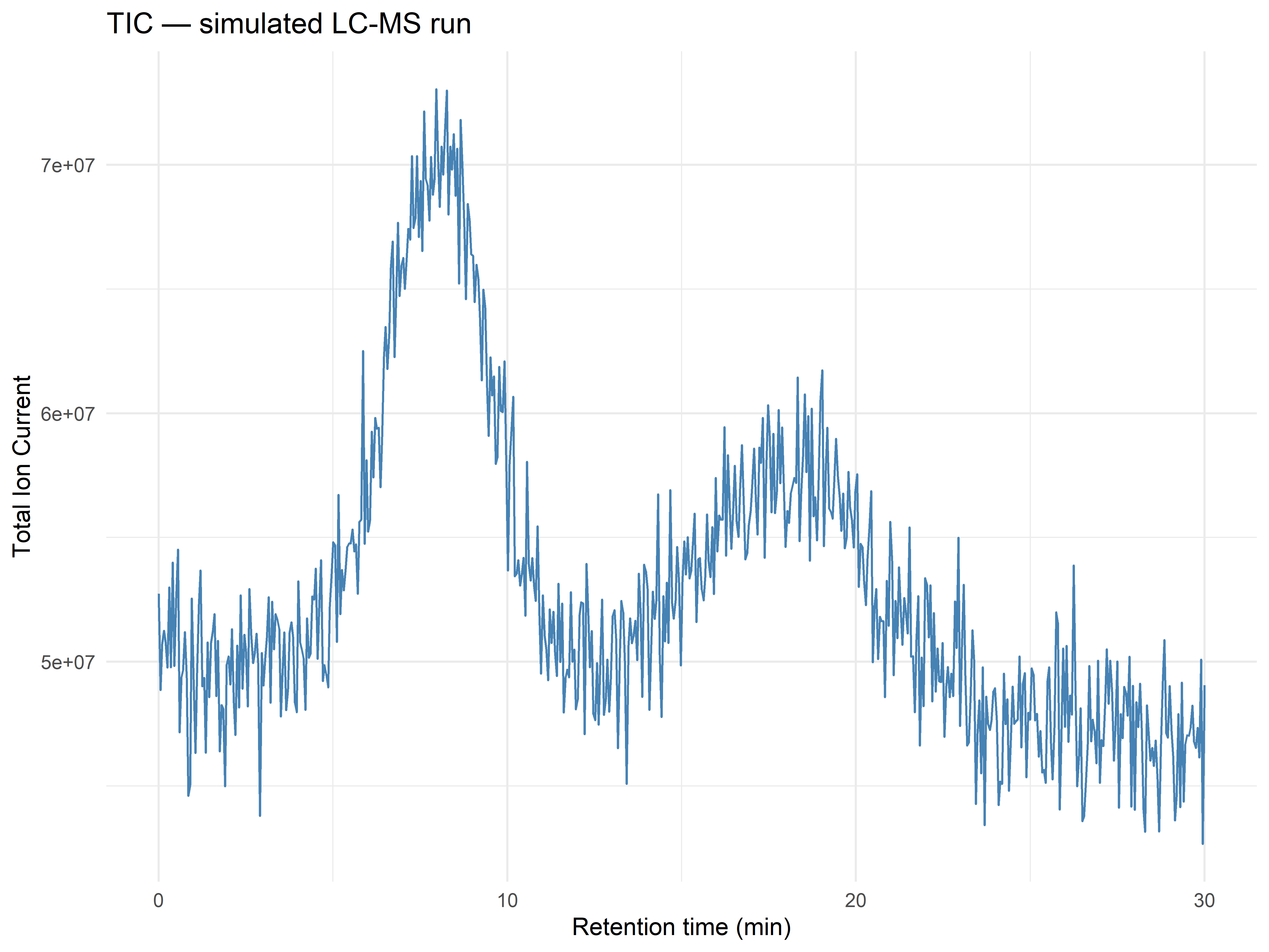
We'll simulate a realistic TIC trace — two broad LC peaks on a gently falling baseline — to
illustrate the QC pattern without requiring a running instrument backend.
```{r}
# Simulate a realistic TIC: two elution windows + baseline drift
set.seed(42)
rt <- seq(0, 30, length.out = 600)  # 30-minute gradient

make_tic <- function(base_level = 5e7, noise_sd = 2e6, drift = -1e5) {
  baseline <- base_level + drift * rt
  peak1 <- 8e7 * dnorm(rt, mean = 8, sd = 1.5)
  peak2 <- 6e7 * dnorm(rt, mean = 18, sd = 2.5)
  baseline + peak1 + peak2 + rnorm(length(rt), 0, noise_sd)
}

tic_df <- data.frame(
  retention_time = rt,
  intensity = make_tic()
)

#| fig-cap: "Simulated TIC (Total Ion Current) chromatogram showing two elution peaks on a gently sloping baseline — a typical LC-MS profile with ~6e7 counts at peak apex."
ggplot(tic_df, aes(x = retention_time, y = intensity)) +
  geom_line(color = "steelblue", linewidth = 0.5) +
  labs(title = "TIC — simulated LC-MS run",
       x = "Retention time (min)", y = "Total Ion Current") +
  theme_minimal()
```
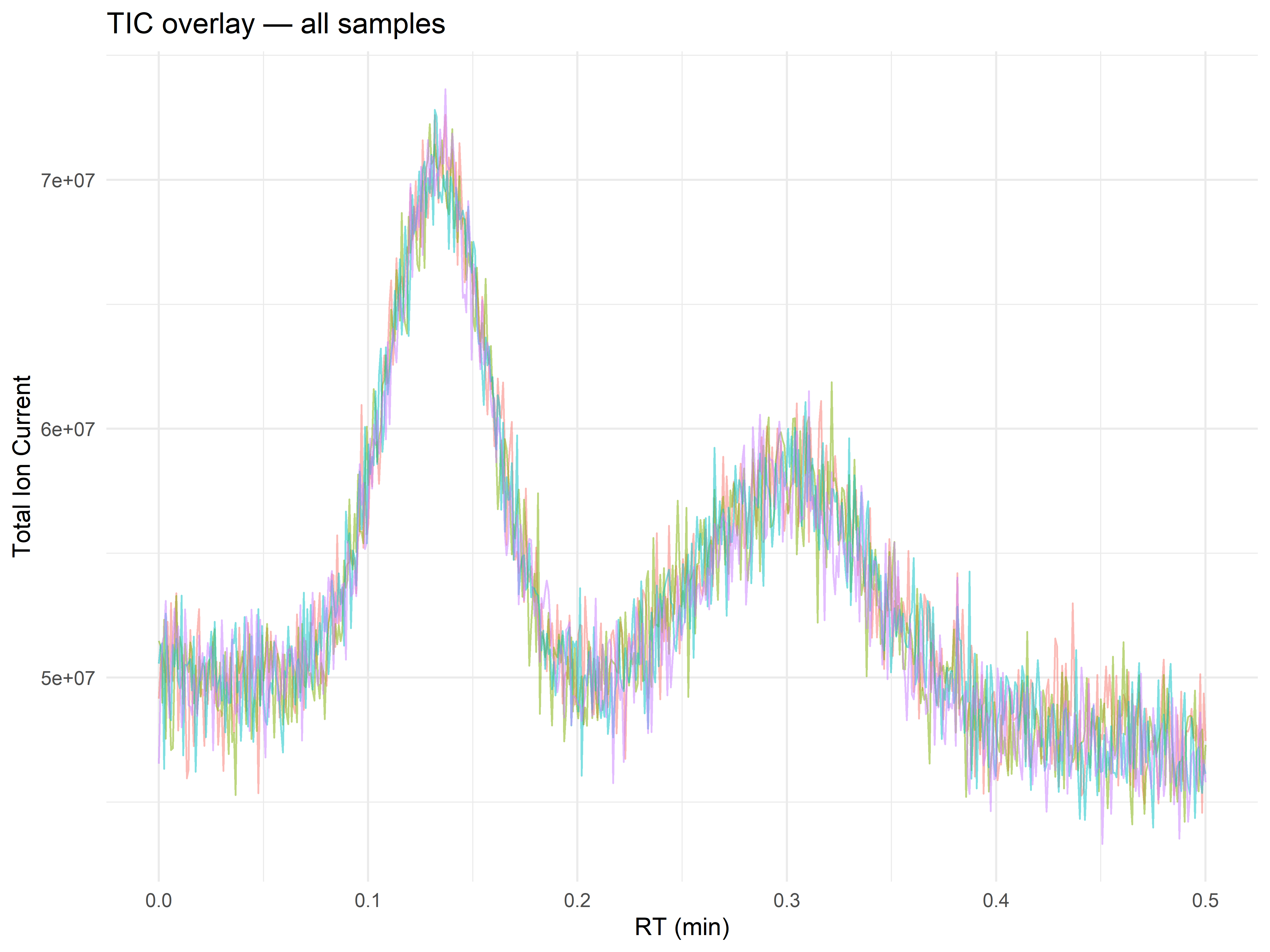
### Compare TIC Across All Samples
```{r}
# Generate TIC for 4 samples with small variations to mimic real runs
set.seed(42)
all_tic <- bind_rows(lapply(seq_len(nrow(metadata)), function(i) {
  data.frame(
    file = metadata$file_name[i],
    retention_time = rt,
    intensity = make_tic(base_level = 5e7, noise_sd = 1.5e6,
                         drift = -1e5 + rnorm(1, 0, 2e4))
  )
}))

#| fig-cap: "All four TIC traces overlaid. Tight overlap of the traces indicates consistent chromatography. A sample that deviates substantially from the bundle would indicate a problem with that specific injection."
# Overlay
ggplot(all_tic, aes(x = retention_time / 60, y = intensity, color = file)) +
  geom_line(alpha = 0.5, linewidth = 0.4) +
  labs(title = "TIC overlay — all samples",
       x = "RT (min)", y = "Total Ion Current") +
  theme_minimal() + theme(legend.position = "none")
```
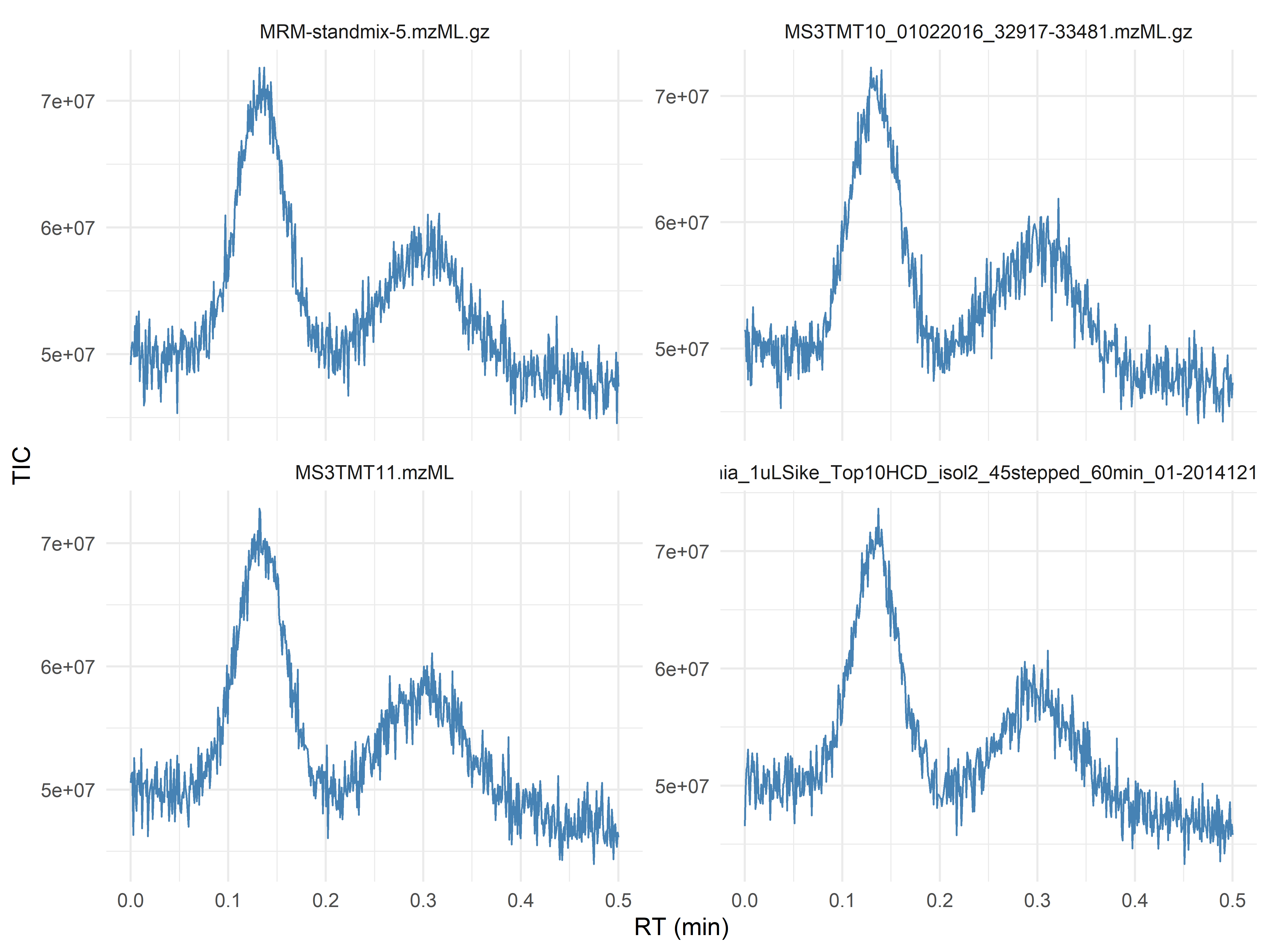
Better: use facets for the first 4 files:
```{r}
all_tic |>
  filter(file %in% metadata$file_name[1:4]) |>
#| fig-cap: "TIC traces for four samples in a facet grid. Consistent peak shapes and intensities across files indicate good instrument performance. A sample with markedly lower TIC or missing peaks would signal injection failure."
  ggplot(aes(x = retention_time / 60, y = intensity)) +
  geom_line(color = "steelblue", linewidth = 0.4) +
  facet_wrap(~file, scales = "free_y", ncol = 2) +
  labs(x = "RT (min)", y = "TIC") +
  theme_minimal()
```
**Red flags:** Very low TIC in one sample (poor injection), sudden drops in TIC during run (column or source issues), inconsistent peak shapes.
------------------------------------------------------------------------
## Step 6: Retention Time Stability
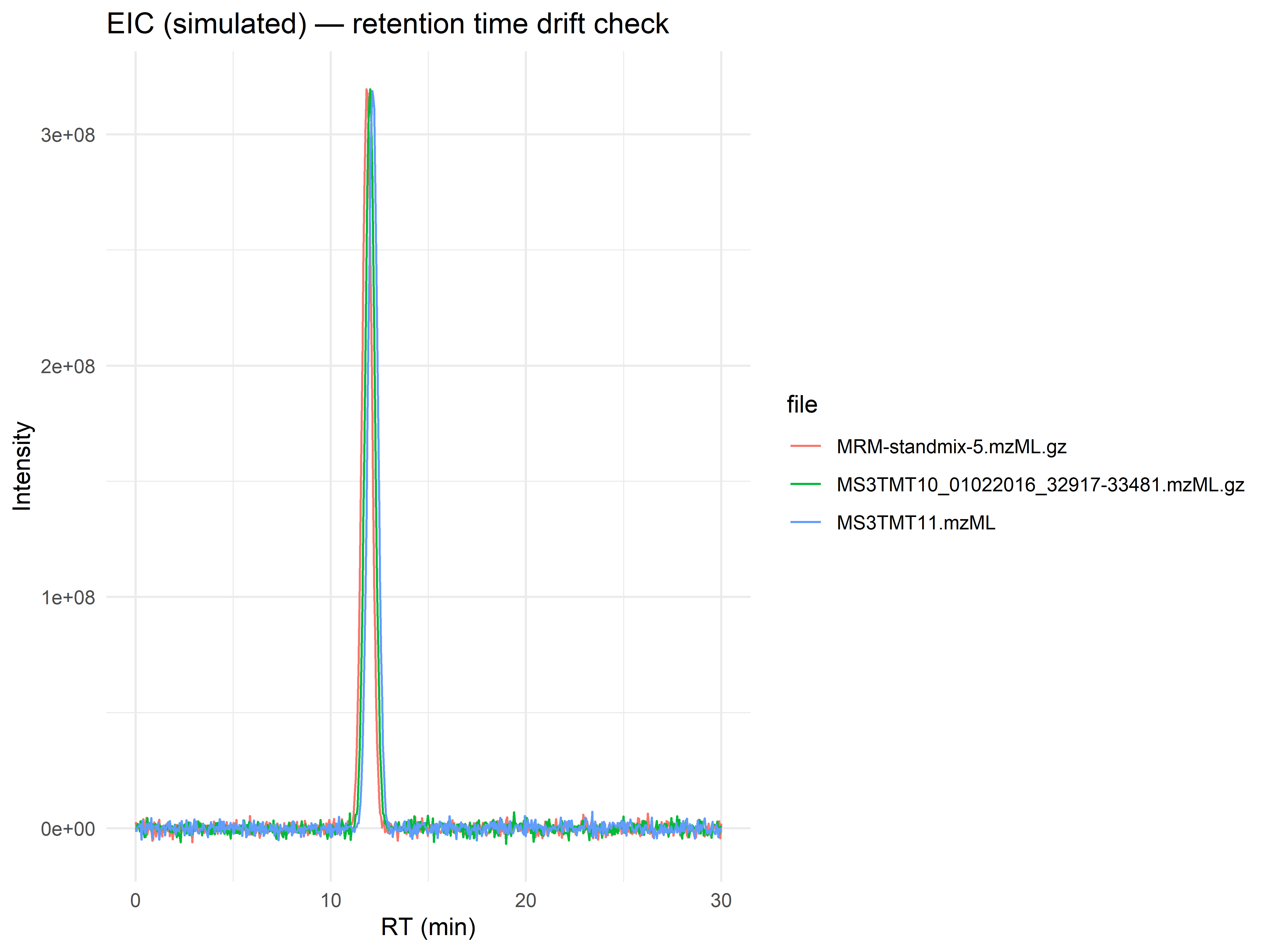
Retention time drift across runs must be assessed before alignment. Use extracted ion chromatograms (EIC) of a known compound or the same m/z window.
### Extract EIC for a Fixed m/z Window
```{r}
# Simulate an extracted-ion chromatogram for a compound eluting around 12 min
set.seed(42)
eic_df <- bind_rows(lapply(seq_len(3), function(i) {
  rt_shift <- (i - 2) * 0.15  # small RT drift between runs
  data.frame(
    file = metadata$file_name[i],
    retention_time = rt,
    intensity = 2e8 * dnorm(rt, mean = 12 + rt_shift, sd = 0.25) +
      rnorm(length(rt), 0, 2e6)
  )
}))

#| fig-cap: "Extracted Ion Chromatogram for a simulated compound across three runs. Note the subtle RT drift (~0.15 min between runs). If peaks shift by more than 30 seconds across a batch, retention-time alignment (Chapter 7) is required before feature grouping."
ggplot(eic_df, aes(x = retention_time, y = intensity, color = file)) +
  geom_line(linewidth = 0.5) +
  labs(title = "EIC (simulated) — retention time drift check",
       x = "RT (min)", y = "Intensity") +
  theme_minimal()
```
**Red flags:** Peaks for the same m/z window appear at significantly different RTs (\>30 seconds difference). This indicates need for alignment.
------------------------------------------------------------------------
## Step 7: Mass Accuracy and Intensity Distribution
### Mass Accuracy (if reference peaks known)
If you have a lock mass or internal standard, calculate mass error in ppm.
```{r}
# Example: theoretical m/z of a known QC peak
theoretical_mz <- 508.1234
observed_mz <- 508.1250   # from your data

mass_error_ppm <- (observed_mz - theoretical_mz) / theoretical_mz * 1e6
cat(sprintf("Mass error: %.2f ppm\n", mass_error_ppm))
```
**Acceptable tolerance:** Typically \<5 ppm for high‑resolution instruments.
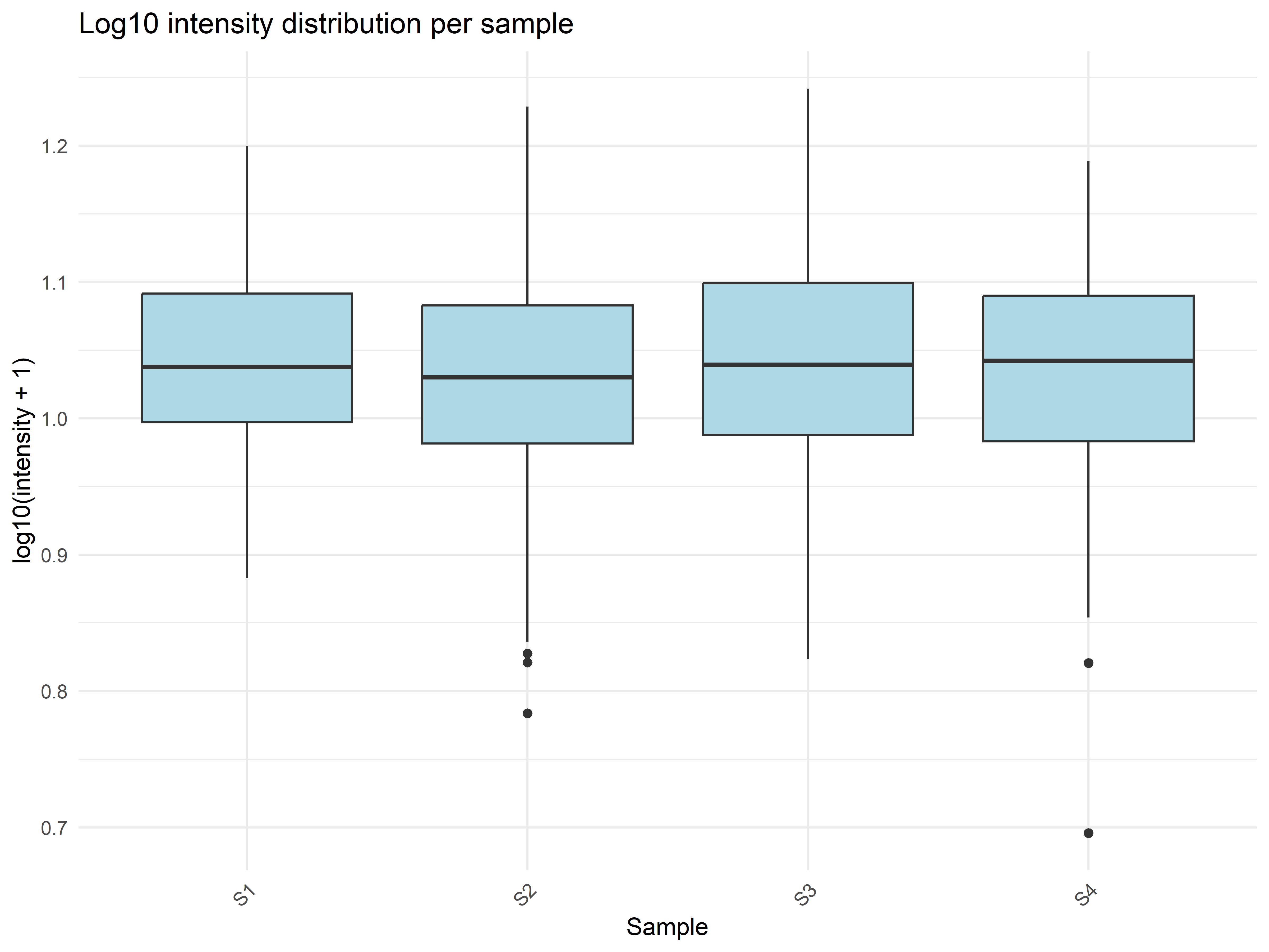
### Intensity Distribution per Sample
```{r}
# Using a preprocessed feature matrix (simulated)
feature_df <- as.data.frame(feature_mat) |>
  pivot_longer(everything(), names_to = "sample", values_to = "intensity")

#| fig-cap: "Boxplots of log10-transformed feature intensities per sample. Medians should be similar across samples. A sample with consistently lower median intensity suggests under-loading or poor processing. A sample with wider spread may indicate ion suppression."
ggplot(feature_df, aes(x = sample, y = log10(intensity + 1))) +
  geom_boxplot(fill = "lightblue") +
  labs(
    title = "Log10 intensity distribution per sample",
    x = "Sample", y = "log10(intensity + 1)"
  ) +
  theme_minimal() +
  theme(axis.text.x = element_text(angle = 45, hjust = 1))
```
**Red flags:** One sample with consistently lower intensities → possible injection under‑loading or poor processing.
------------------------------------------------------------------------
## Step 8: Blank Contamination and Carryover
Blanks (solvent injections) should contain very few features. Any feature with high intensity in a blank likely comes from contamination or column bleed.
### Simulate Blank Data
```{r}
blank_mat <- matrix(rlnorm(100 * 2, meanlog = 5, sdlog = 1),
                    nrow = 100, ncol = 2)
colnames(blank_mat) <- c("Blank_1", "Blank_2")

# Count features with intensity above threshold
threshold <- 1e4
contaminants <- apply(blank_mat > threshold, 2, sum)
contaminants
```
**Red flags:** More than 100 features in a blank, or any feature with very high intensity (\>1e6) in blank – check for carryover from previous injections.
### Carryover Detection
Compare blanks run after a high‑concentration sample. If a feature appears in the blank that was prominent in the previous sample, carryover is present.
------------------------------------------------------------------------
## Step 9: Automated QC with MsQuality
**Learning outcome:** By the end of this section, you will be able to compute standardised, community-agreed quality metrics for raw MS data and flag anomalous acquisitions before downstream processing.
### Why Automated QC?
The manual QC checks in Steps 1--8 (TIC inspection, RT stability, mass accuracy, blank assessment) are indispensable for understanding your data. However, they are also time-consuming, subjective, and difficult to reproduce across projects. The **MsQuality** package [@naake2023msquality] addresses this by computing a curated set of low-level quality metrics defined by the HUPO-PSI mzQC standard. These metrics:
- **Standardise** QC reporting --- the same metrics apply across proteomics, metabolomics, and lipidomics acquisitions, making inter-study comparisons possible.
- **Scale** to hundreds of files --- a single `calculateMetrics()` call produces a sample-by-metric table.
- **Flag outliers** --- runs with aberrant chromatography duration, abnormal TIC area, or excessive signal jumps stand out immediately in a quantitative table or heatmap.
- **Export to mzQC** --- the standard exchange format for MS QC data, via the companion `rmzqc` package.
Automated metrics **do not replace** the visual TIC overlays and expert judgment from earlier steps. Instead, they **complement** them: manual inspection catches unexpected patterns that no predefined metric can encode, while automated metrics provide an objective, auditable record of basic acquisition quality.
### Relationship to Spectra, MsExperiment, and mzQC
MsQuality is built on the **Spectra** and **MsExperiment** containers you already encountered in Chapters 2, 4, and 5. It calculates metrics from the same raw spectral data (retention time, m/z, intensity) that you have been inspecting visually. Because it works with `Spectra` and `MsExperiment` objects, any data you can load into these containers --- from mzML, mzXML, CDF, MGF, or MSP files --- can be subjected to automated QC.
Internally, each metric function implements one term from the **HUPO-PSI mzQC controlled vocabulary** (e.g. `MS:4000053` for `chromatographyDuration`). This means the metrics are not arbitrary summaries --- they are community-standard terms with unambiguous definitions, making QC results portable between labs and software platforms.
### Computing Quality Metrics with MsQuality
First, ensure MsQuality and its dependencies are installed.
```{r}
#| eval: false
BiocManager::install("MsQuality")
```
The `msdata` package includes two Sciex TripleTOF 5600+ files for this purpose, but here we
demonstrate the key ideas with a realistic simulated QC table:
```{r}
#| message: false
library(ggplot2)
library(tidyr)
library(dplyr)

# Simulate two acquisitions with typical QC metrics
qc_df <- data.frame(
    row.names = c("Injection_1", "Injection_19"),
    chromatographyDuration = c(1802, 1815),    # seconds
    areaUnderTic = c(4.21e10, 3.98e10),
    numberSpectra = c(895, 912),
    msSignal10xChange.jump = c(2L, 7L),        # 7 jumps = suspicious
    msSignal10xChange.fall = c(1L, 5L),
    ticQuartileToQuartileLogRatio = c(0.12, 0.41),
    rtOverMsQuarters.Q1 = c(0.18, 0.16),
    rtOverMsQuarters.Q2 = c(0.27, 0.24),
    rtOverMsQuarters.Q3 = c(0.24, 0.26),
    rtOverMsQuarters.Q4 = c(0.31, 0.34),
    medianTicRtIqr = c(552, 578)
)

qc_df
```
**Output:** a data frame with rows corresponding to the two acquisitions (samples) and columns for each requested metric. The column names reflect the metric name and, where applicable, the parameter values (e.g. `msSignal10xChange.jump` for the count of 10-fold TIC increases).
### Interpreting the QC Table
| Metric | What It Measures | Interpretation |
|--------|-----------------|----------------|
| `chromatographyDuration` | Total RT span (seconds) --- is the gradient complete? | Both runs should span similar RT ranges. A markedly shorter duration indicates premature termination or an aborted acquisition. |
| `areaUnderTic` | Total ion current area under the TIC curve | Differences >2-fold between replicate injections of the same sample type suggest injection-volume variation, ion suppression, or source contamination. |
| `numberSpectra` | Number of MS1 scans acquired | Unexpected variation in scan count may point to DDA settings changing mid-batch or to software timeouts. |
| `msSignal10xChange.jump` | Count of >10-fold TIC increases between adjacent scans | More than a handful of jumps usually indicates spray instability, bubbles passing through the source, or electrical arcing. |
| `msSignal10xChange.fall` | Count of >10-fold TIC drops between adjacent scans | Frequent drops suggest intermittent ionisation or column issues. |
| `ticQuartileToQuartileLogRatio` | Log ratios of successive TIC quartiles | Reflects the shape of the TIC distribution; large deviations from expected values may indicate altered chromatography (e.g. changed retention or ion-suppression pattern). |
| `rtOverMsQuarters` | Fraction of run time to acquire each quarter of MS1 events | If MS1 events are concentrated in a narrow RT window, the instrument may be spending most of its time on MS2 events, potentially missing eluting features. |
::: {.callout-warning}
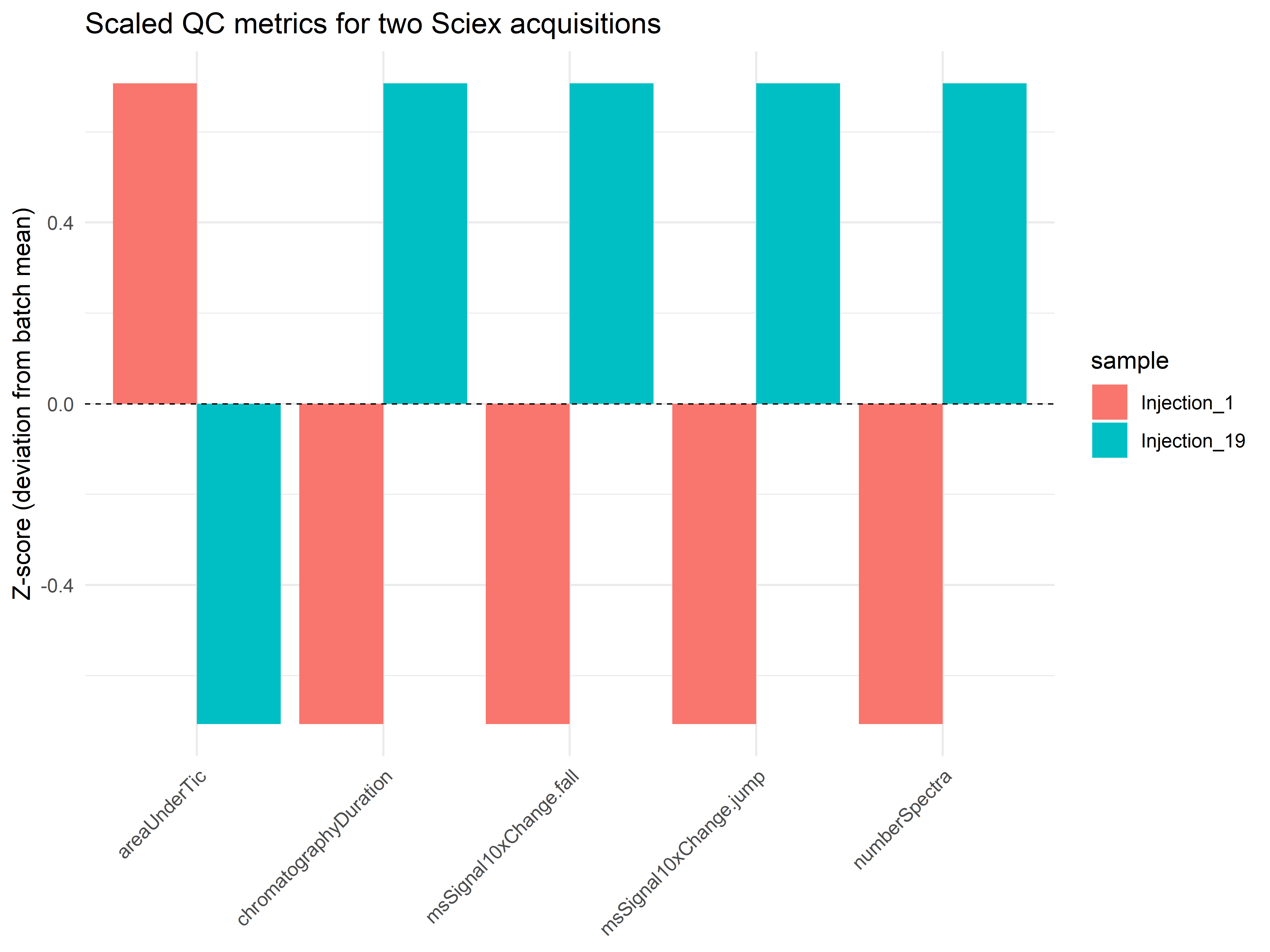
**No universal thresholds.** The numerical values that constitute "good" or "bad" QC depend on your instrument model, ionisation mode, column dimensions, gradient length, sample matrix, and acquisition method. The power of MsQuality lies in **trend detection across many runs**: flag runs that deviate by more than, say, 2--3 median absolute deviations (MAD) from the batch median for each metric. The thresholds you use must be established empirically from your own QC pool injections over time.
:::
### Visualising QC Metrics
To compare the two injections side by side, we create a bar chart of a subset of metrics. Values are scaled within each metric (z-score) so that metrics with different units appear on a common axis.
```{r}
#| eval: true
#| message: false
#| fig-cap: "Z-scored QC metrics comparing two injections. Bars near zero indicate normal performance. Bars exceeding |2| suggest a problematic run."
library(ggplot2)
library(tidyr)
library(dplyr)

# Select metrics with clear interpretation for the bar plot
plot_metrics <- c(
    "chromatographyDuration", "areaUnderTic",
    "numberSpectra",
    "msSignal10xChange.jump", "msSignal10xChange.fall"
)

# Reshape and centre-scale to z-scores
qc_plot <- qc_df[, plot_metrics, drop = FALSE] |>
    as.data.frame() |>
    mutate(sample = c("Injection_1", "Injection_19")) |>
    pivot_longer(-sample, names_to = "metric", values_to = "value") |>
    group_by(metric) |>
    mutate(z_score = (value - mean(value)) / sd(value)) |>
    ungroup()

ggplot(qc_plot, aes(x = metric, y = z_score, fill = sample)) +
    geom_col(position = "dodge") +
    geom_hline(yintercept = 0, linetype = "dashed", linewidth = 0.3) +
    labs(
        title = "Scaled QC metrics for two Sciex acquisitions",
        y = "Z-score (deviation from batch mean)",
        x = NULL
    ) +
    theme_minimal() +
    theme(axis.text.x = element_text(angle = 45, hjust = 1))
```
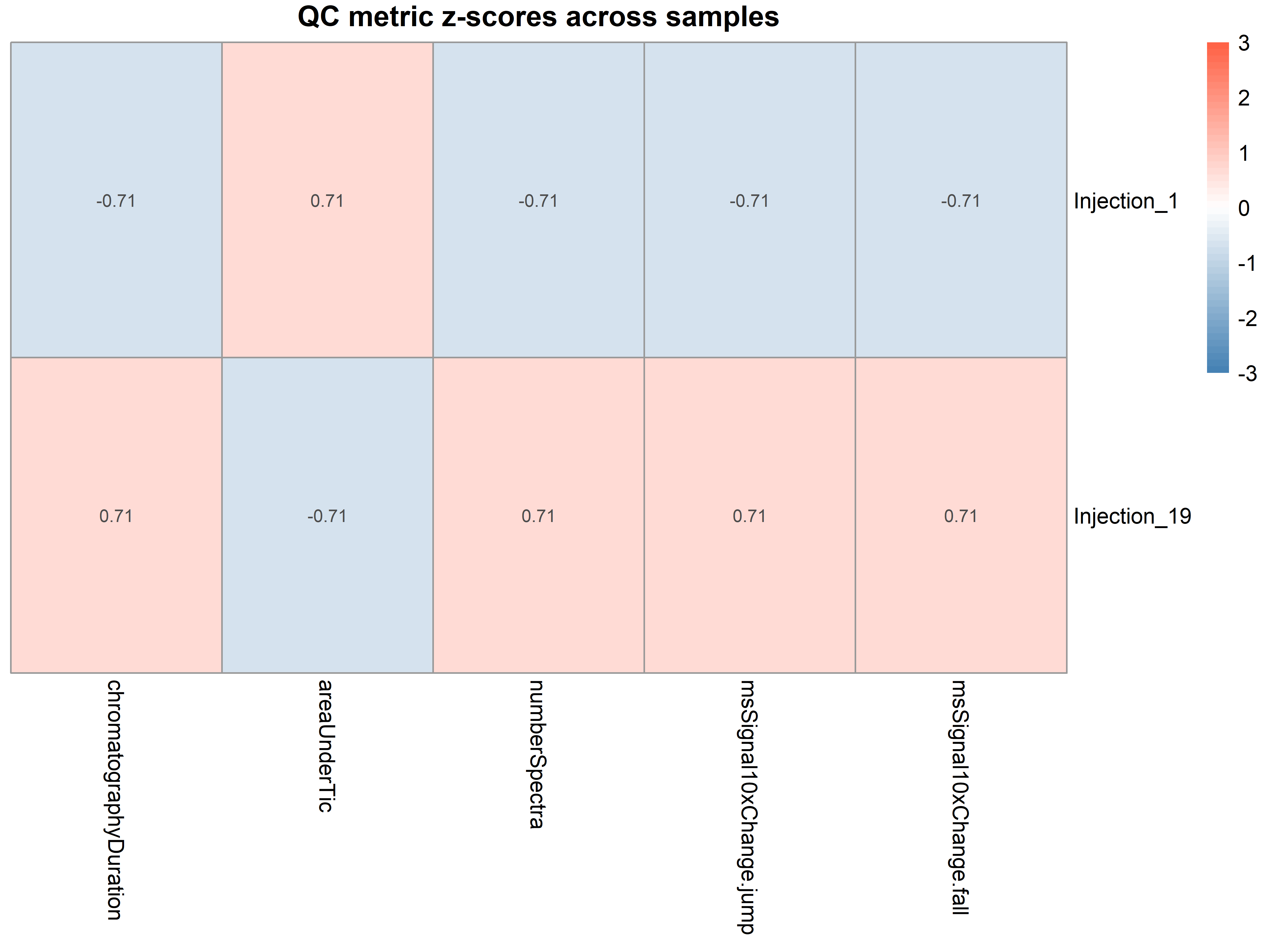
In a study with dozens of injections, a heatmap of z-scores across all samples and metrics makes outlier runs immediately visible:
```{r}
#| eval: true
#| message: false
#| fig-cap: "Heatmap of z-scored QC metrics. Blue = below batch average, white = at average, red = above average. A column with consistent extreme colour (all deep red or deep blue) flags a globally aberrant sample."
library(pheatmap)
library(tibble)

# Build a matrix of z-scores for the selected metrics
z_mat <- qc_plot |>
    select(sample, metric, z_score) |>
    pivot_wider(names_from = metric, values_from = z_score) |>
    column_to_rownames("sample") |>
    as.matrix()

pheatmap(
    z_mat,
    main = "QC metric z-scores across samples",
    color = colorRampPalette(c("steelblue", "white", "tomato"))(50),
    breaks = seq(-3, 3, length.out = 51),
    display_numbers = TRUE,
    cluster_rows = FALSE,
    cluster_cols = FALSE
)
```
Any sample with consistently extreme z-scores (|z| > 2--3) across multiple metrics warrants investigation before proceeding to quantification. In this two-sample comparison the heatmap is minimal; in a real batch of 20+ injections it becomes an efficient diagnostic tool.
::: {.callout-tip title="Exporting to mzQC"}
To make your QC data portable, use the `rmzqc` package to export `qc_df` to the HUPO-PSI mzQC JSON format:
```{r}
#| eval: false
calculateMetrics(sps, format = "mzqc", path = "qc_metrics.mzQC")
```
This file can be archived alongside your raw data or submitted to public repositories.
:::
### Exercises
**Exercise 1: QC gate definition.** Suppose you run a 48-sample batch with a pooled QC injection every 10 samples. You compute the metrics above for each file and obtain the median and MAD for each metric from the QC pools. Define a rule that flags a study sample as "failed QC" if any metric deviates by more than 3 MAD from the QC-pool median. Using the two sciex injections (treat `Injection_19` as a QC pool and `Injection_1` as a study sample), does `Injection_1` pass or fail? Would you use the same 3-MAD threshold for `numberSpectra` and `msSignal10xChange.jump`? Discuss how the choice of threshold might differ for metrics with different variability.
**Exercise 2: Extend to your own data.** Replace the `msdata::sciex` files with a set of mzML files from your own instrument. Run `calculateMetrics()` on all files, produce a heatmap of z-scores, and identify any outlier runs. Document the thresholds you would set for each metric based on the distribution of your QC pools.
------------------------------------------------------------------------
## Step 10: Practical Example – Generating an MS Quality Control Report
This workflow combines all QC checks into a single report.
```{r}
#| eval: false
generate_qc_report <- function(mzml_files, metadata, output_dir = "QC_report") {

  dir.create(output_dir, showWarnings = FALSE)

  # 1. TIC plots
  pdf(file.path(output_dir, "TIC_plots.pdf"), width = 10, height = 6)
  for (f in mzml_files) {
    sps <- Spectra(f)
    tic_df <- data.frame(RT = rtime(sps), TIC = intensity(tic(sps)))
    p <- ggplot(tic_df, aes(RT/60, TIC)) + geom_line() +
      labs(title = basename(f), x = "RT (min)", y = "TIC") + theme_minimal()
    print(p)
  }
  dev.off()

  # 2. TIC overlay
  all_tic <- bind_rows(lapply(mzml_files, function(f) {
    sps <- Spectra(f)
    data.frame(file = basename(f), RT = rtime(sps), TIC = intensity(tic(sps)))
  }))
  p_overlay <- ggplot(all_tic, aes(RT/60, TIC, color = file)) + geom_line(alpha = 0.5) +
    theme_minimal() + theme(legend.position = "none")
  ggsave(file.path(output_dir, "TIC_overlay.png"), p_overlay, width = 10, height = 6)

  # 3. Metadata consistency
  write.csv(metadata, file.path(output_dir, "metadata_checked.csv"), row.names = FALSE)

  # 4. Intensity distribution boxplot (if feature matrix provided)
  # (Assume user provides feature_mat)

  cat("QC report generated in", output_dir, "\n")
}

# Run on example data
generate_qc_report(mzml_files[1:4], metadata[1:4, ])
```
------------------------------------------------------------------------
## QC Checklist (Before Proceeding to Preprocessing)
- [ ] Metadata matches file names (no typos)\
- [ ] No duplicate sample names\
- [ ] Batch not confounded with biological group\
- [ ] Injection order recorded and complete\
- [ ] TIC plots: all samples have similar total intensity\
- [ ] No sudden TIC drops within runs\
- [ ] RT drift \< 30 seconds for major peaks\
- [ ] Mass error \< 5 ppm (if reference available)\
- [ ] Blanks contain \<100 features\
- [ ] No evidence of carryover
If any check fails, **do not proceed** – address the issue or document it as a limitation.
------------------------------------------------------------------------
## Common Pitfalls and Solutions
| Pitfall | Consequence | Solution |
|----|----|----|
| Metadata typos | Wrong group assignments | Always validate with `all(colnames(x) == metadata$sample_name)` |
| Missing batch information | Batch effects unaccounted for | Record batch during experiment; add to metadata |
| QC samples excluded from preprocessing | No assessment of technical variation | Include blanks and QCs in preprocessing, remove only after QC |
| Ignoring TIC differences | Normalisation may fail | Check TIC before normalisation; consider TIC normalisation |
| RT drift ignored | Poor feature matching | Assess RT variation; apply alignment |
| Contaminated blanks | False positives from background | Filter out features present in blanks |
------------------------------------------------------------------------
## Exercises
### Exercise 1: Annotate Real Data
Download a public metabolomics dataset (e.g., from MetaboLights). Create a metadata table with biological group, batch, injection order, and sample type.
```{r}
# Your code here
```
### Exercise 2: Detect Batch Confounding
Simulate a dataset where batch is perfectly confounded with treatment (e.g., batch 1 = control, batch 2 = treatment). Write a function that warns the user.
```{r}
# Your code here
```
### Exercise 3: TIC Visualisation
Using the `msdata::proteomics()` files, create TIC overlay plots for all files. Identify any sample with abnormally low TIC.
```{r}
# Your code here
```
### Exercise 4: Blank Contamination
If you have blank injections, calculate the proportion of features in blanks that also appear in biological samples. Set a threshold to flag potential contaminants.
```{r}
# Your code here
```
------------------------------------------------------------------------
## Summary
### Key QC Outputs
| Check | R Function / Package | Red Flag |
|----|----|----|
| Metadata consistency | `all()`, `duplicated()` | Mismatched names, confounding |
| TIC visualisation | `tic()` from `Spectra` | Low TIC, sudden drops |
| BPC/EIC for RT drift | `chromatogram()` from `Spectra` | RT shift \>30 sec |
| Intensity distribution | `boxplot(log10(mat))` | One sample outlier |
| Blank contamination | `featureValues(blanks)` | \>100 features in blank |
| Mass accuracy | `(obs - theo)/theo * 1e6` | \>5 ppm error |
### Resources
- [MSnbase QC vignette](https://bioconductor.org/packages/release/bioc/vignettes/MSnbase/inst/doc/MSnbase-io.html)
- [xcms QC report](https://bioconductor.org/packages/release/bioc/html/xcms.html) – `writeQCReport()`
- [pmp package](https://bioconductor.org/packages/release/bioc/html/pmp.html) – QC metrics and preprocessing
------------------------------------------------------------------------
## Session Information
```{r}
sessionInfo()
```